Theme
The Theme plugin is a default Quick Brick plugin added to all mobile and TV apps.
The function of the Quick Brick Theme plugin is:
-
To migrate SDK keys for assets, fonts, labels, colors out of the platform SDK and have them configurable in a Quick Brick plugin
-
To provide base values for assets, colors, fonts and labels out of the box that can then be modified
-
Replace the current hard-coded values for an App's design grid with configurable settings for spacing, margins, gutters etc.
-
Allow to extend and customize per app the available design tokens without impacting the SDK
-
Provide a consistent way for plugins to reuse the app’s design tokens, and have consistent fallbacks when some values are not found
-
Make configuration available at run time eliminating the need for the multiple App builds that native Zapp developers are familiar with
Currently supported Theme tokens for mobile apps
The exact tokens supported in the default theme plugin will increase over time. This is what is currently supported:
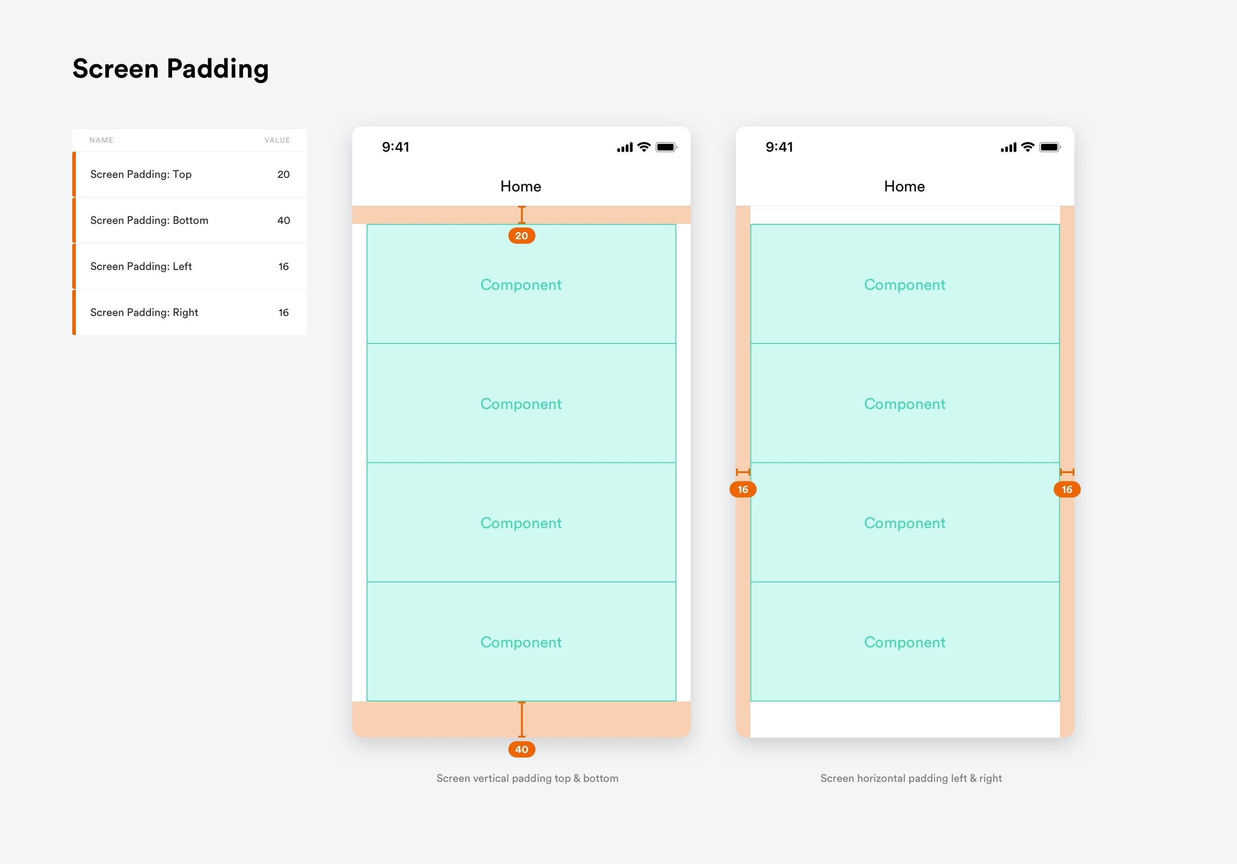
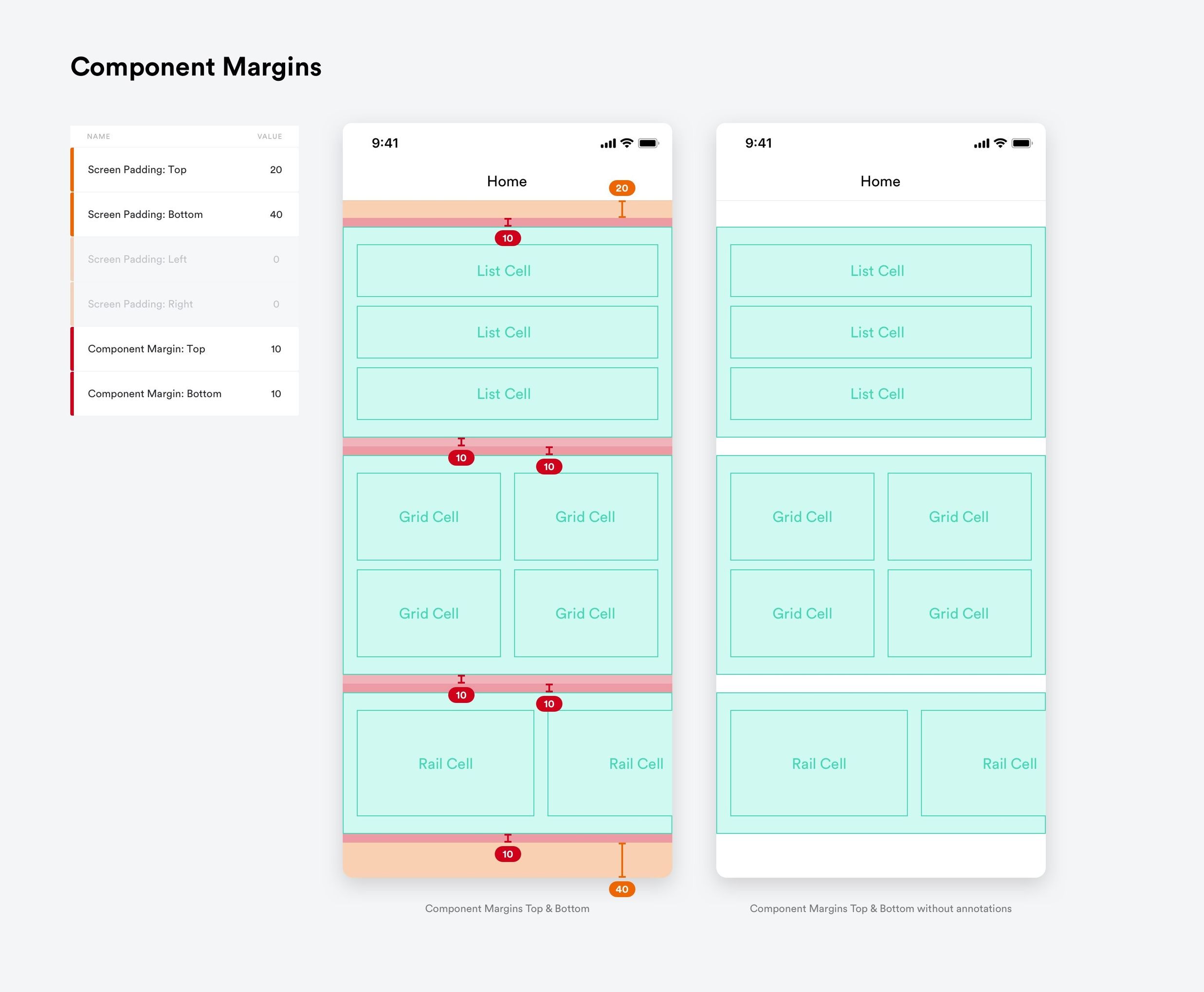
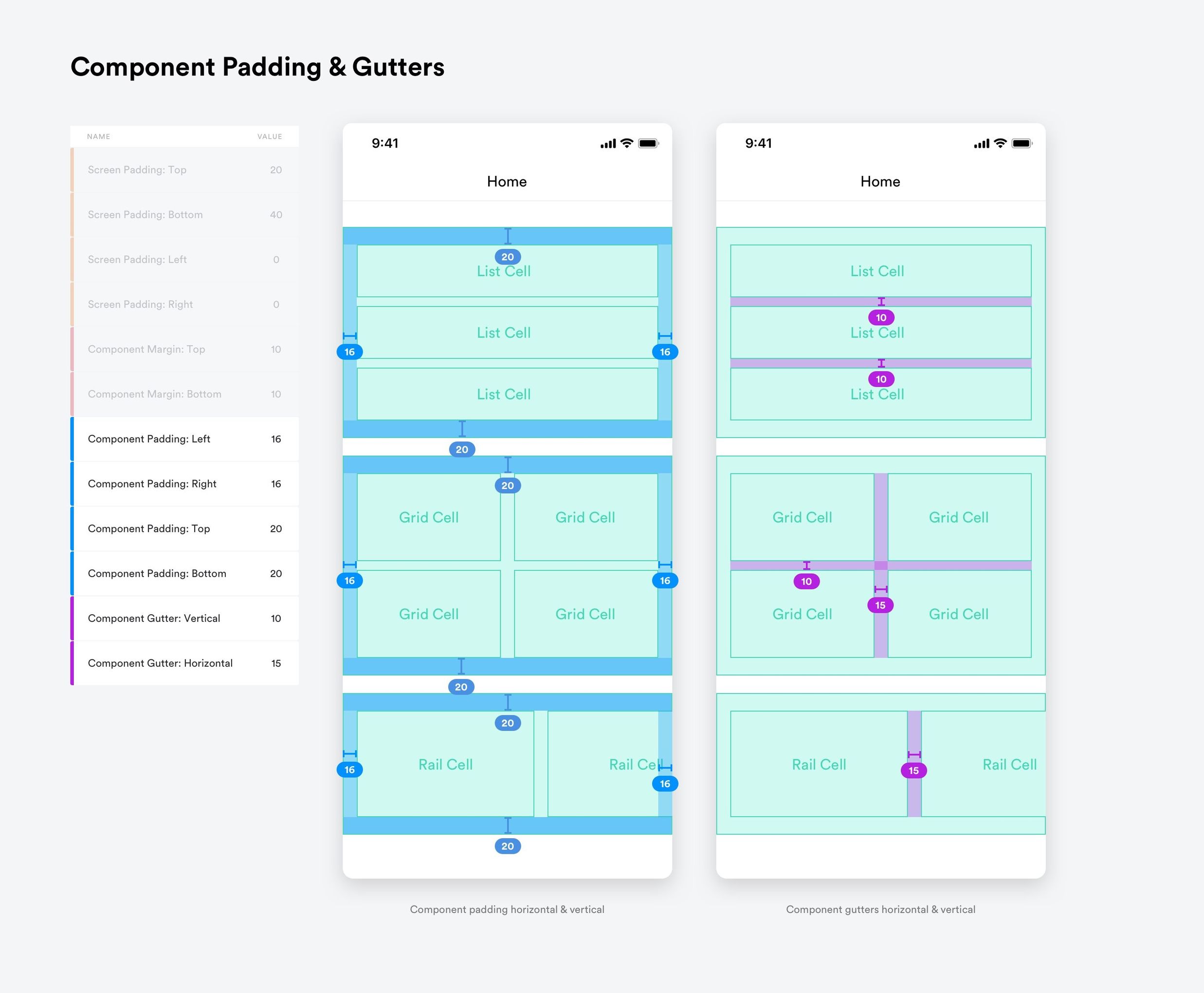
Spacing Presets
Spacing values can be used to inject values into components/screens so that they have consistent spacing from screen to screen. These values can be overridden in a component plugin if desired, otherwise the components take the values provided by the Theme plugin
Spacing presets are explained in the following illustrations:
Theme Defaults
Default values that can be adjusted per app ensure an app will appear sensible when it is first built.
Background Presets
App background color can be added here as well as app background images (where applicable - at the moment only TV apps utilize background images). More info about the assets can be found here.
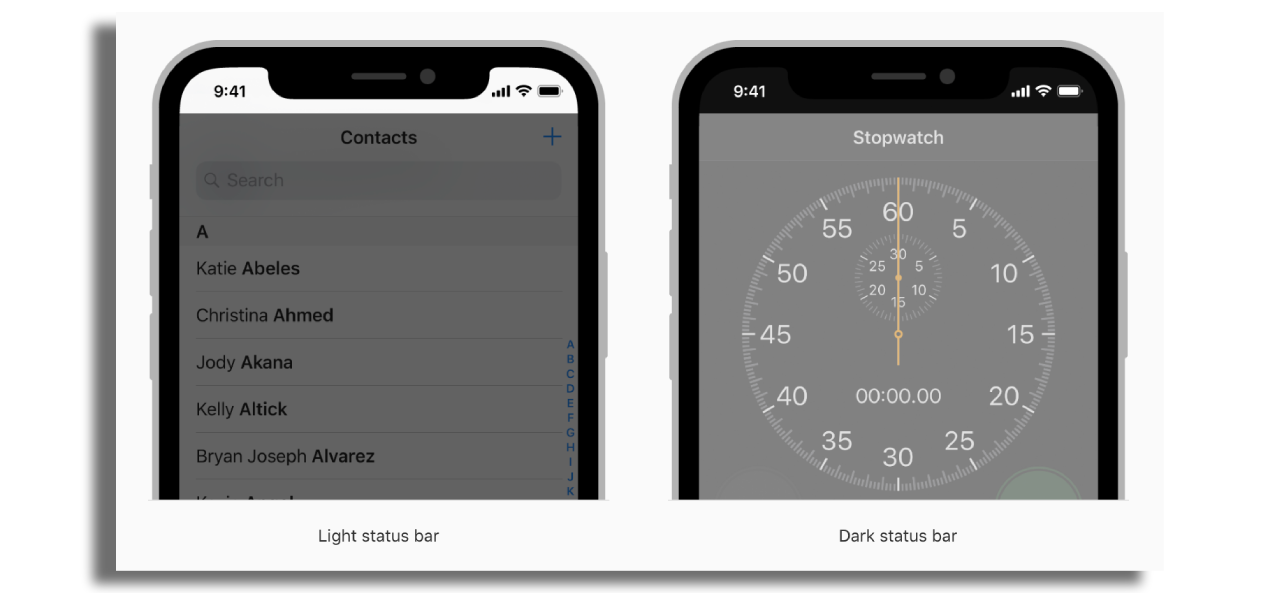
Status Bar Presets
The background colour of the status bar can be altered here along with the ‘theme’ of the status bar contents.
Status bar theme illustration from Apple:
Asset Zip Upload
Not currently supported
Currently supported Theme tokens for TV apps
Safe Area for TV screens
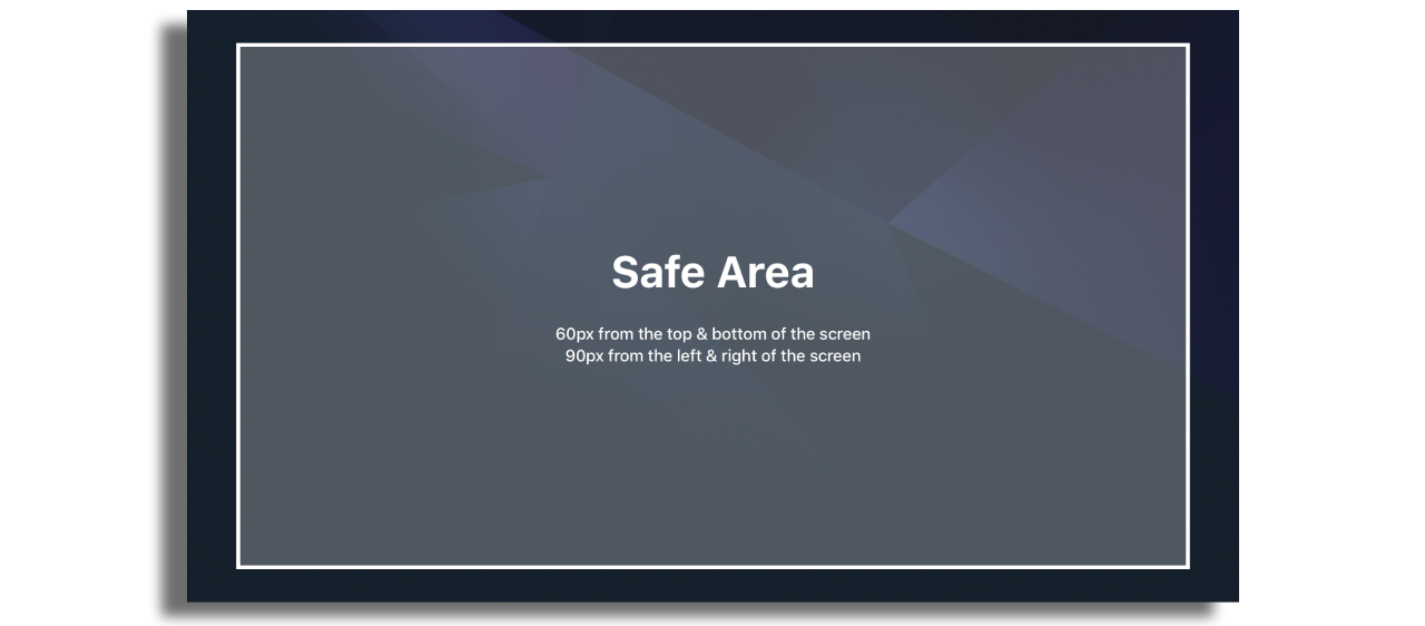
It is important to only place focus content within the safe area of a TV screen. Due to historic issues with TV screens, content outside of this area cannot be guaranteed to be visible on all TV screens.
The general rule is do not place focus content less than 90px from the left and right edges or less than 60px from the top and bottom edges.
It is OK for navigation methods such as scrolling to place out of focus content at the screen edges
Large images for poster type presentations can also go outside of the safe area but the images should be art-worked to only have critical information such as embedded text or other important visual content inside the safe area.
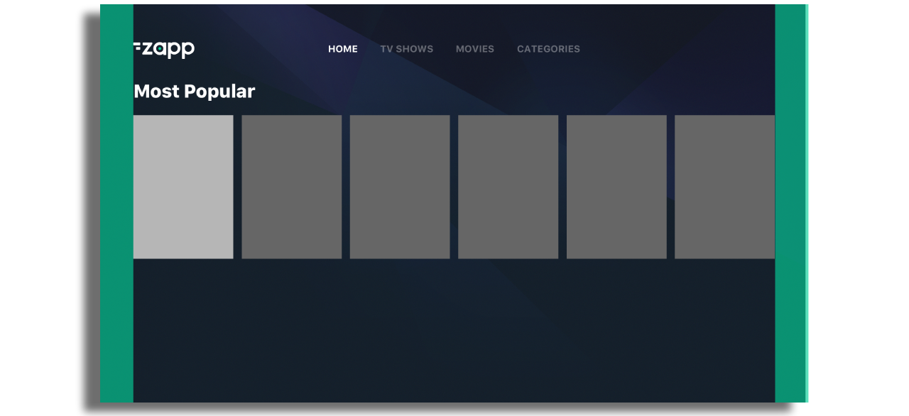
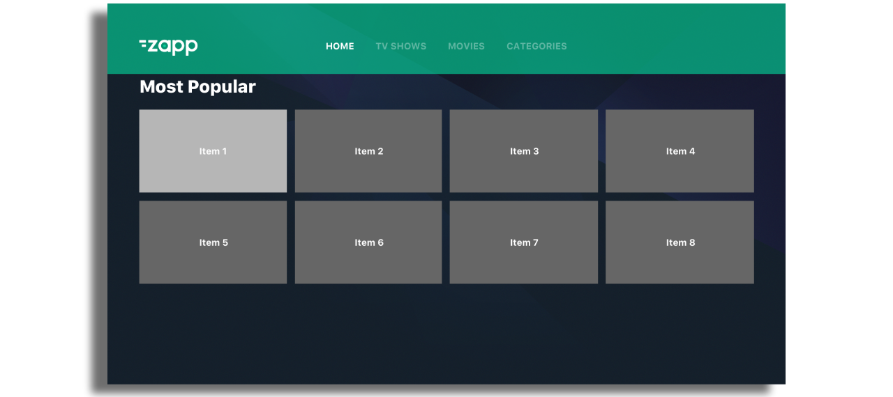
Component Padding Left and Right
Default Values 90px
Component-Padding-Left & Right is used to space components away from the edges of the screen. A minimum of 90px (safe area) should be used here to ensure content is visible on all screens.
Anchor Point
Default Value 200px
The anchor-point defines the Y Position (measured from the top of the screen) of component positioning when in focus.
In the example, both rails are positioned at 200px from the top when they are in focus. This value can be overridden on a component by component basis.
The anchor point will be obeyed by the header if one is present in a component group.

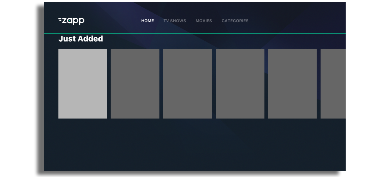
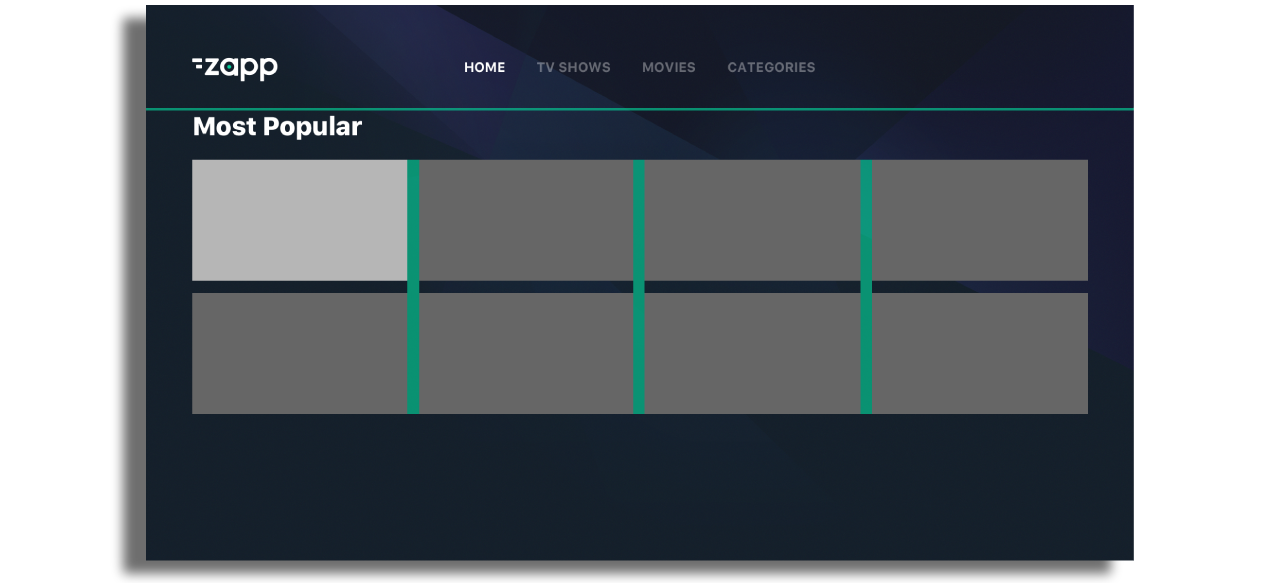
Component Gutters
Default Value 24px
Vertical gutters are used to add space between items in a row.
Horizontal gutters are used to add space between columns.
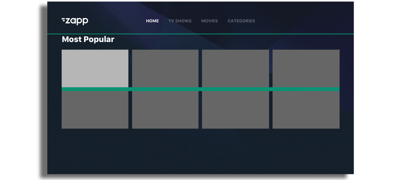
Component Margins
Default Value 0px (left and right) and 90px (bottom)
Component Margins are used to distance components from one another on a screen. Here we have a component-margin-bottom of 90px.
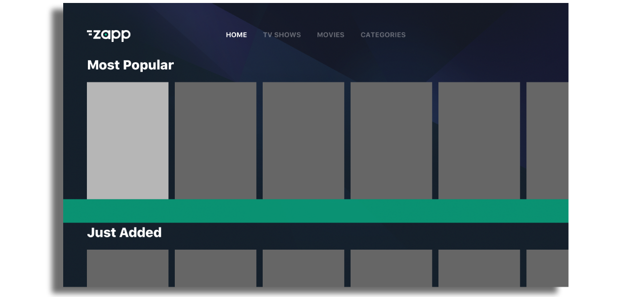
Screen Margin Top
Default Value 200px
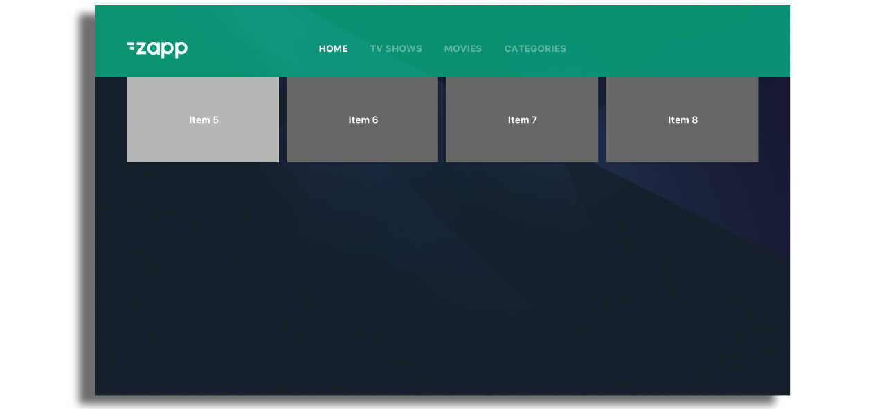
Screen-Margin-Top is used to define an area at the top of the screen where content is clipped when scrolling down through the UI.
In the example you can see that the previous row of content (item 1...4)can no longer be seen on the screen. If the Screen Margin Top was set to ‘0’ then you would see this previous row (item 1...4) underneath the top menu.
App Background Color
Sets the background color of the app but most apps are constructed with an app background image loaded as an asset in Zapp.
App assets
Not currently used
Loading Spinner
This is the color of the spinner seen whilst content is loading in a screen. (The app loading spinner is set in the style keys within Zapp)
Downscaling images
For optimal performance, the downscaling feature requires an API that supports image resizing. Activating this feature seamlessly replaces the width and height in the URL with the precise dimensions of the cell's image.
This option can be enabled in the plugin.

To ensure the proper functioning of this feature, it's important to include specific image size parameters in the image URL. Here are some examples:
https://myServer.com/myimage.jpg?height=100
https://myServer.com/myimage.jpg?width=100
https://myServer.com/myimage.jpg?width=100&height=300
Without the required parameters, the downscaling feature will not work as intended. Ensure the API supports image resizing and enable this option within the theme plugin for a tailored image experience on your front end.
Downscaling only works when the original image dimensions are larger than the requested size—for example, if the original image width is 400px and width=280 is provided, the image can be downscaled; if the requested dimensions are equal to or larger than the original image, the replacement will not be applied.