TV Navigation
Applicaster supports a range of navigation elements that allow connection to screens or actions.
On TVs, the Top Menu Bar is supported, along with horizontal and vertical tabs.
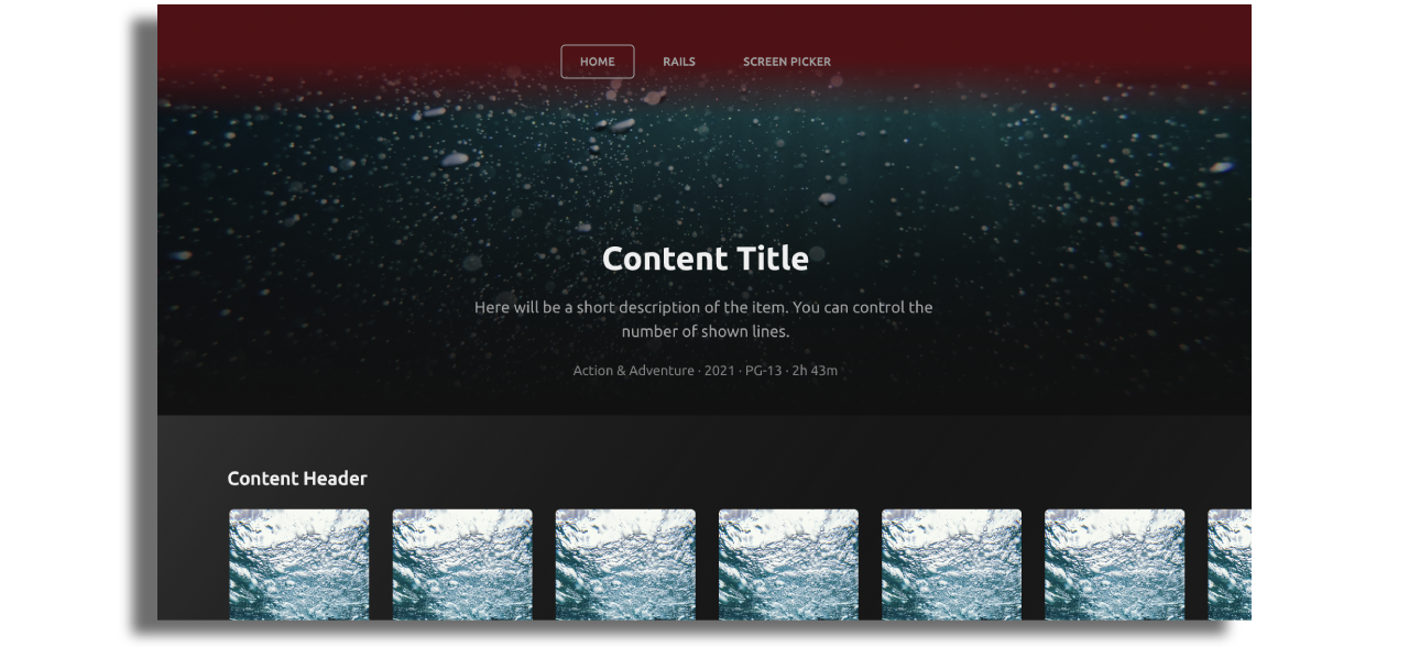
Tv Top Menu

The Top Menu must be used in an app and can include the following components:
- A single logo.
- Screen Navigation Buttons.
- A single optional action button (e.g. for a settings page).
Important notes:
- Only one TV Top Menu can be used per app.
- A maximum of 8 items can be added to the Top Menu.
- Very large font sizes and long titles will cause the menu to be truncated. Keep menu titles short and font sizes reasonable.
Styling the Top Menu
Top Menu styles can be adjusted in different ways: Background image, color or gradient.
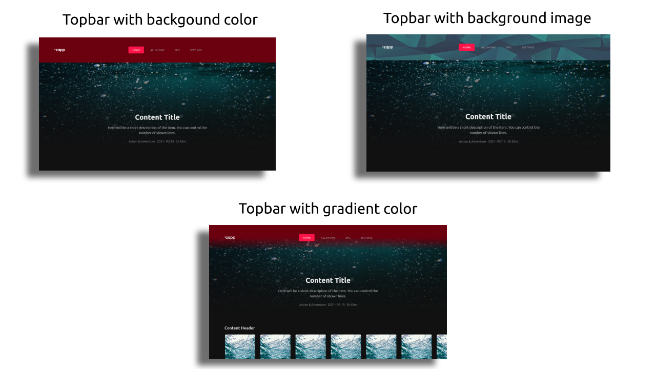
Color or Background image
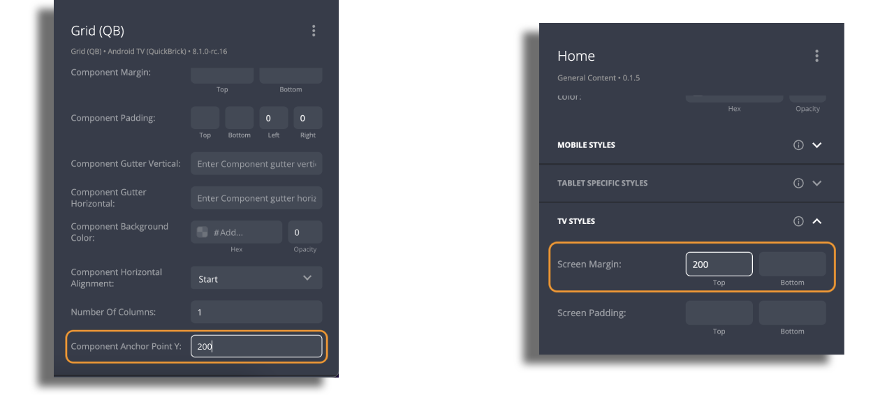
If you use an image or a color as a background for the Top Menu, set both the screen top margin and component anchor point to 200 — the default height of the Top Menu. This ensures that the background appears correctly below the Top Menu. If your desired background has a different height, adjust the screen and component settings accordingly.
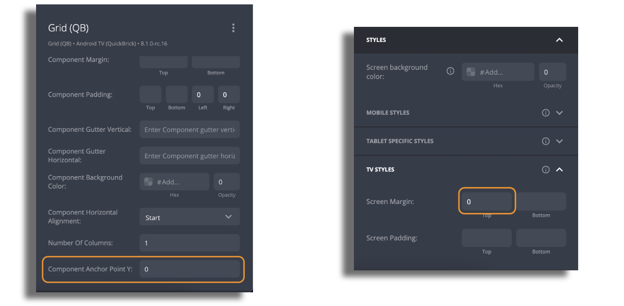
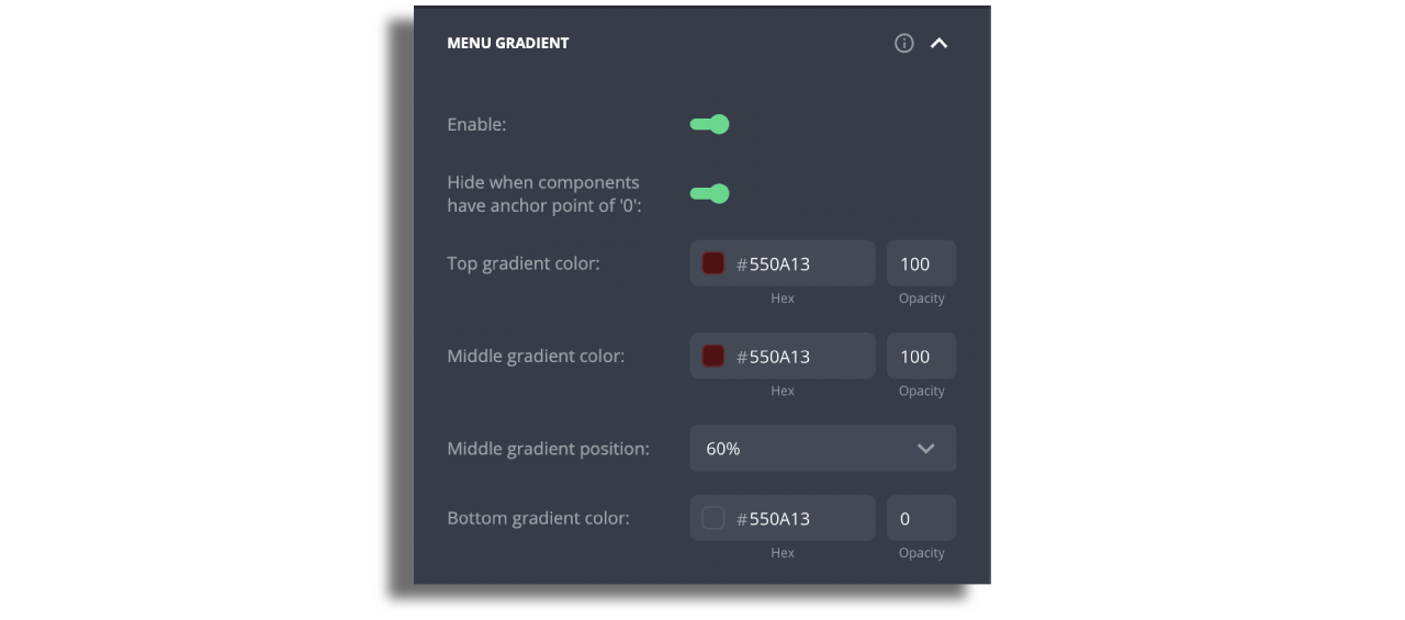
Gradient Color
If you use a gradient color background, follow the same steps as above. However, if you want to mask components with large images behind the Top Menu, set both the screen top margin and component anchor point to 0. This creates a seamless visual effect.
To avoid displaying gradient colors over components with large images, you can activate an option to hide the gradient for specific components. For a smooth gradient transition, it's recommended to set the middle gradient position to 60% or higher. There's an option to also add a bottom gradient color.
Styling The Menu Items
Navigation button items currently support text only.
- Set
Data Targetto the screen for that Navigation Button and edit the title. (By default, the menu will set the title to be the name of the screen selected, but this can be overridden). - Set
Screen Presentationto default. - Set
Button Stateto Title.
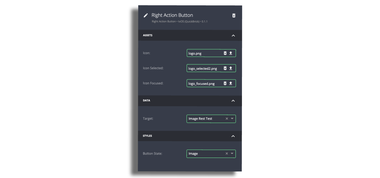
Tv Menu Action Button
- You can use either a title or icons that indicate focused and selected states.
- If using icons, select Image for the
Button State. - Icons should be 40px by 40px in PNG format. Make sure that the assets are exported at a resolution of 3 times the standard pixel density (@3x).
- Set the
Target Screento launch when selecting this menu item.
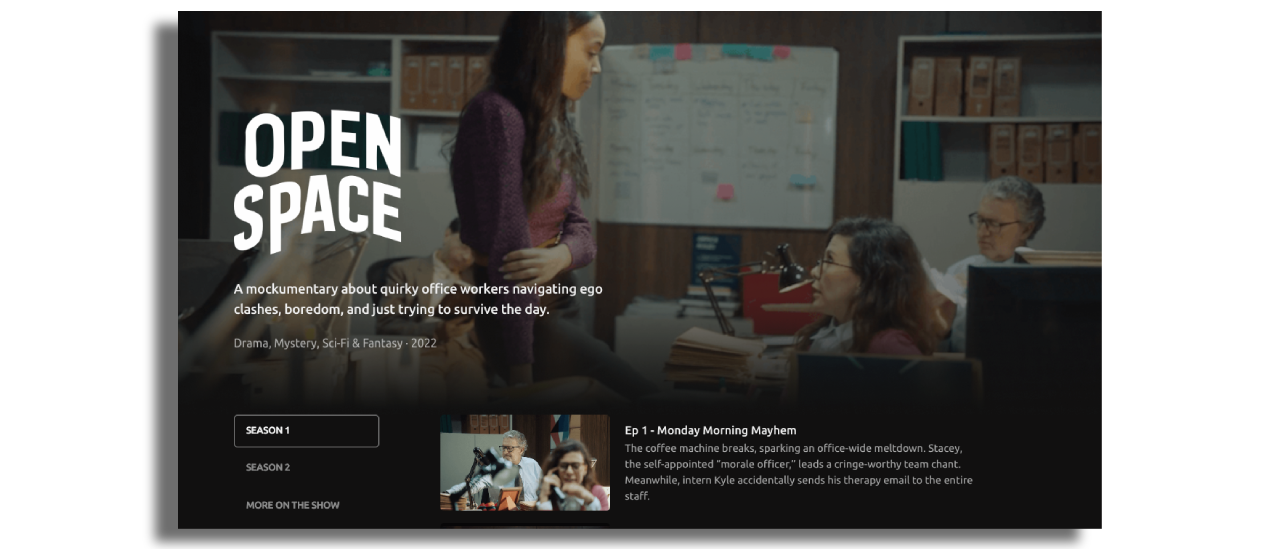
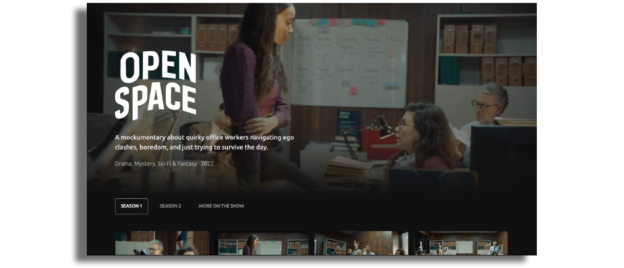
Tabs Screen
The Tabs screen replaces the legacy Screen Picker component. While functionality remains the same, Tabs introduce new flexibility — such as placing a Hero component above the tab navigation.
Tabs allow you to organize content into categories (such as seasons, genres, or collections) and let users quickly switch between them.
A Hero component (e.g. main show image, banner, or promotional asset) can now be placed above the Tabs for additional branding, emphasis, or highlighting featured content. This makes the screen more visually engaging while keeping navigation clear.
We recommend using Tabs going forward.
You can start with one of the available presets for common use cases:
- Show Screen – Multiple Seasons (Vertical Tabs)
Ideal for stacking categories in a vertical list.
- Show Screen – Multiple Seasons (Horizontal Tabs)
Best suited when content categories are limited and can fit in a row across the top.
Configuration
- Data source: Attach a Data Source Feed or a Manual Feed to drive the list of screens in the Tabs.
- Navigation: Content inside a Tab may link to another screen for deeper navigation.
- Hero component: Place an image, banner, or video above the Tabs. This Hero can be configured independently of the Tabs content.
Styling
Tabs can be displayed vertically or horizontally and customized with the following options:
- Width: fixed or dynamic
- Alignment: left, center, right
- Background: color or image (recommended height for image backgrounds: 76px)
- Text styles: font, size, weight, wrapping, and focus states (default, focused, selected, selected & focused)
- Assets: optional images or icons inside Tab items
The flexibility of styling allows Tabs to match the overall look and feel of your app, whether minimal or image-rich.