Cell styles guide
Mobile
Cell styles allow full customization of the look and feel of each component. There are several common properties shared across all Power Cells. The most notable are image and typography attributes, though other common elements include:
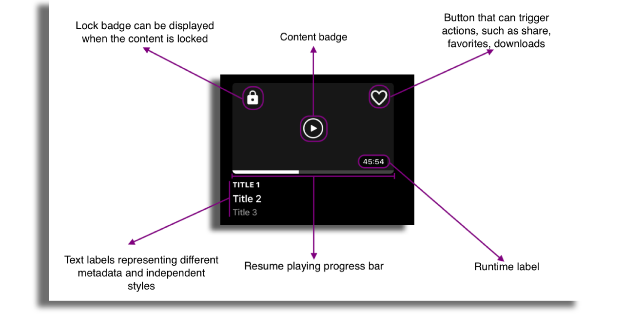
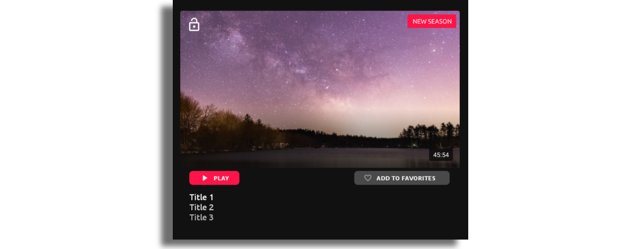
- Content badges that can indicate various content type within the same cell style.
- Lock/Unlock badges, which can indicate if the content requires login or payment. Using this badge requires adding an extension in the feed. More info here.
- Action buttons within the cell. More info can be found here.
- Runtime label with independent styling.
- Resume playing progress bar. More info can be found here.
- Three to six text lables, depending on the power cell selected with the ability to style them independently or completely turn off.
- Ability to set different background color for the item in focus.
- Ability to set custom ratio for the image in addition to predefined list of image ratios.
- Image overlay
- Transform UTC date time into Date Time Format. More info here.
There are 3 types of power cells on mobile:
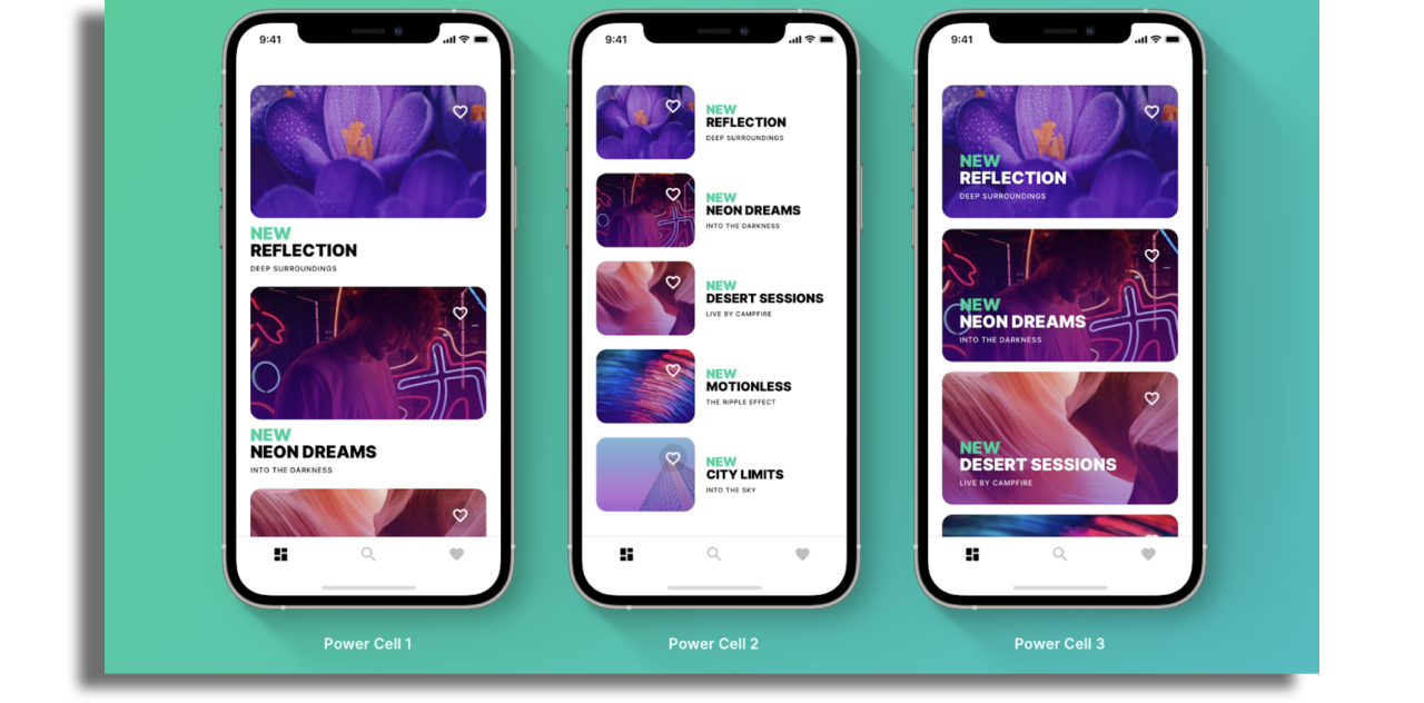
Power Cell 1
Key points are:
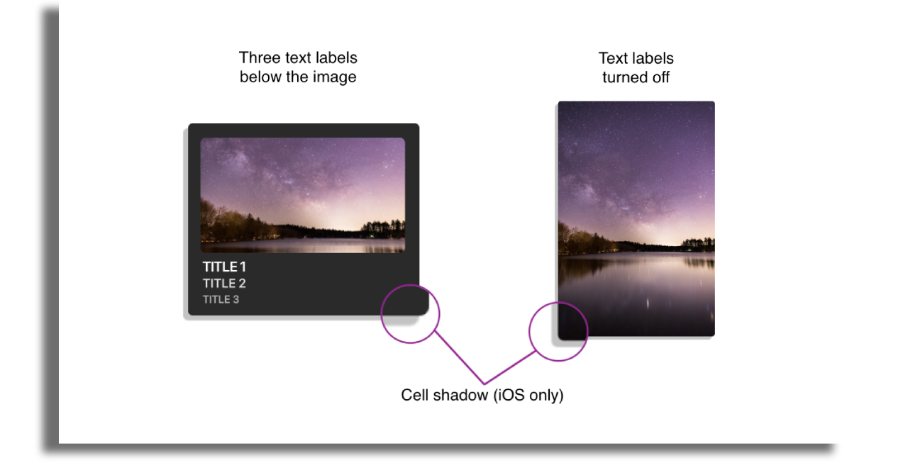
- Three text labels below the image.
- Text labels can be turned off to create cells with image only
- Cell shadow (iOS only)
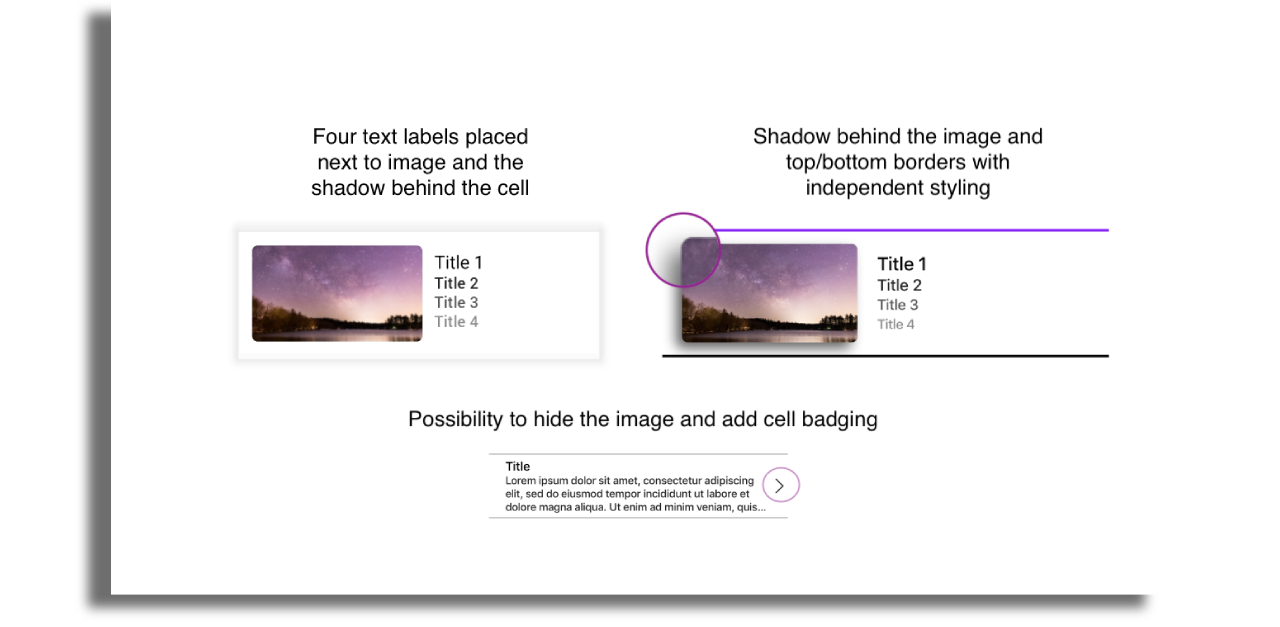
Power Cell 2
Key Points are:
- Text next to image with possibility to turn it off
- Four independantly configurable text labels placed on the same row
- Ability to toggle image on/off
- Badge on the right hand side of the cell
- Top and bottom borders with independent styling
Power Cell 3
Key points are:
- Text over the image
- Three text labels anchored to the top of the cell
- Three text labels anchored to the middle of the cell
- Three text labels anchored to the bottom of the cell
- Possibility to add shadow to the cell
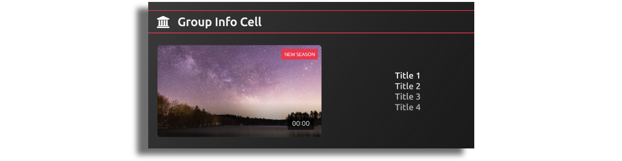
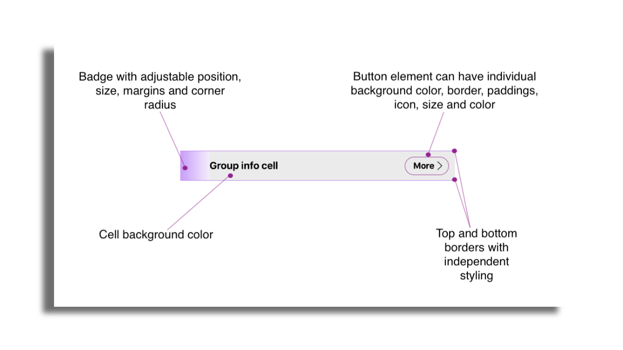
Group Info Cell
This cell is primarily used as a header for a group or section. In addition to text label configuration, there are other styling options:
- Possibility to include an icon or a More button, which opens another screen within the application. To enable this behavior, the destination screen must be mapped to a navigation item with the type
feed. - Button's alignment at the top, middle, or bottom of the cell.
- Individual background colors and borders can be configured for buttons.
- Separate styling configurations for top and bottom borders
TV
TV power cells possess nearly identical capabilities to mobile devices, with only a few configurations that are not included. The following configurations are available on all cells on Tvs:
- Image overlay, corner radius, border color, top and bottom indicator with independent styling, margins and paddings.
- Cell corner radius, background color, border color, top and bottom indicator with independent styling, margins and paddings.
- Static badge
- Lock/Unlock badges, which can indicate if the content requires login or payment. Using this badge requires adding an extension in the feed. More info here.
- Runtime label with independent styling.
- Resume playing progress bar. More info can be found here.
- Interactive Call-to-Action Buttons.
- Between three and nine text labels (depending on power cell) with the ability to alter font family, size, color and background independently. In addition it's also possible to configure the number of lines.
The key differences between the cell styles on the Tvs can be found below:
Power Cell 1
Key points are:
- Up to three text labels and buttons are placed below the image.
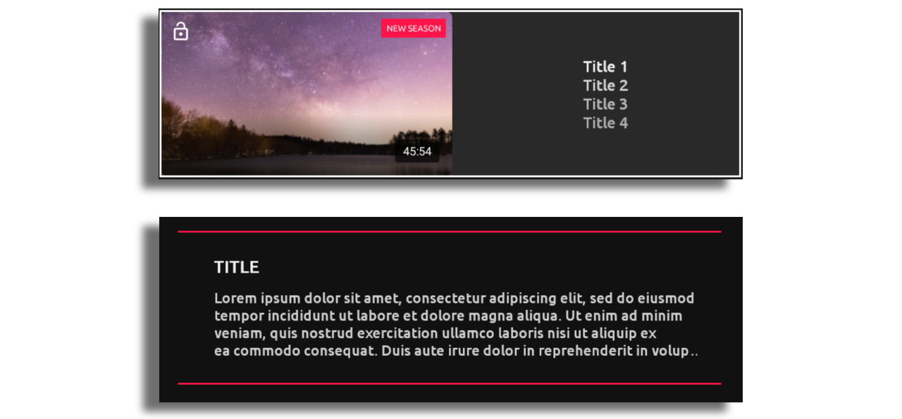
Power Cell 2
Key Points are:
- Up to four text labels and action buttons are placed next to the image.
- Ability to toggle image on/off.
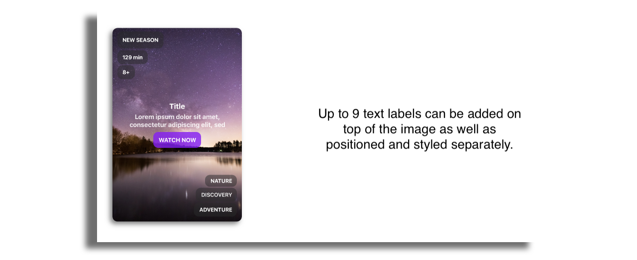
Power Cell 3
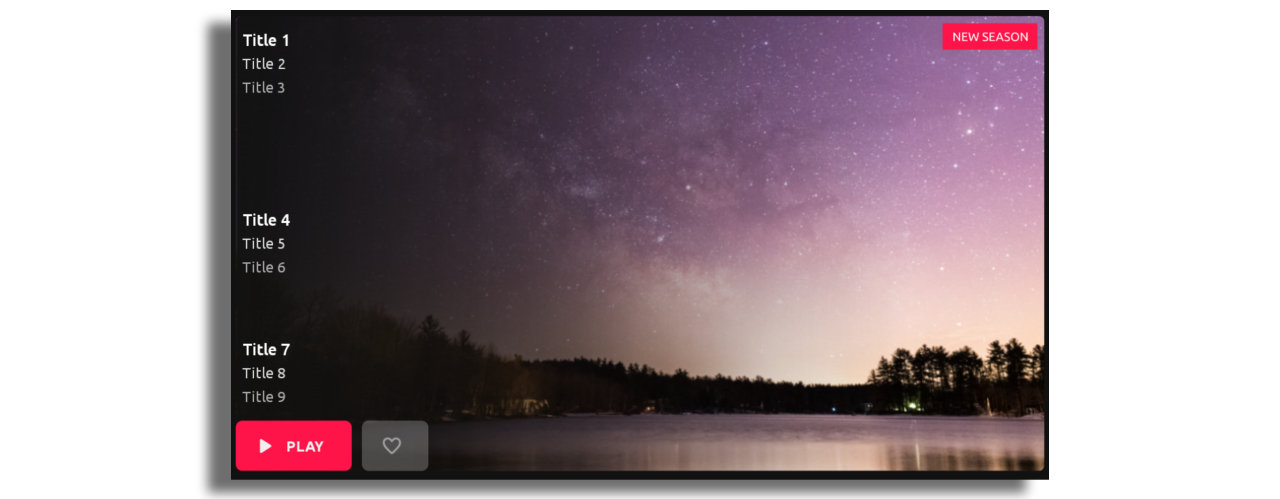
Key points are:
- Up to nine text labels and action buttons are placed over the image.
Group Info Cell
Just like on mobile this cell is primarily used as a header for a group or section. Apart from colors, borders and background color, it's also possible add a badge that will be placed next to the header text.